Canva is already part of many companies’ everyday toolkit. It allows you to quickly create impressive images, presentations, social media posts, prints, and now also digital signage content directly in MediaCloud. Although Canva is an easy and versatile tool, info display communication has slightly different rules than social media or PowerPoint presentations. What works on Instagram may not work on a 55-inch screen in the office lobby.
The attention span of the audience on digital screens is short. Often, the content only catches the eye of a passerby for a few seconds, for example when walking past a restaurant counter or glancing at a dressing room wall. On the other hand, some screens, such as lobbies, waiting rooms or staff areas, are designed for longer viewing, allowing for a more diverse content.
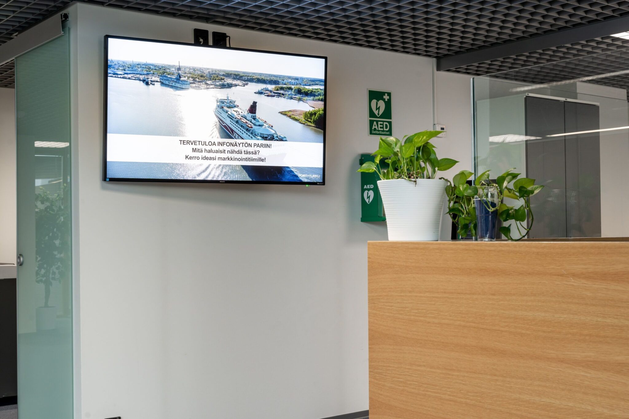
But regardless of the use of the screens, one thing is certain: The content of the digital signage displays must be clear, visually bright and immediately understandable.
In this blog, we’ll go over five of the most common mistakes to avoid when creating digital signage content with Canva.
See instructions for setting up the Canva integration »
Stumbling block 1 – Too much text
It’s easy to write a lot on Canvas. Too much. And when there’s a lot of text, the same thing always happens: the text on the digital screen remains unreadable.
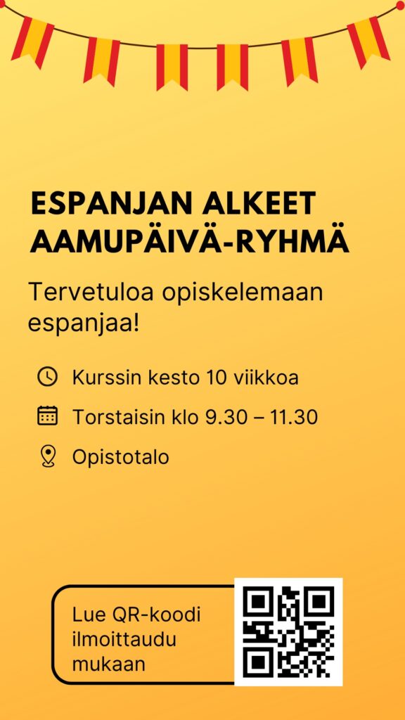
On a digital screen, the message must be readable in 3–5 seconds. If the content looks like an essay, the viewer will not stop and the message will not get through. So, condense your message to one main point and use a large, clear font. A concise title and one in-depth supporting sentence almost always work better than a fully written outline.
✅ Do this
- Summarise the message into one main point
- Use large, clear fonts and short sentences
- If there is a lot to cover, split the messages into multiple slides or views.
- One headline + one supporting sentence almost always works.
❌ Don’t do this:
Small fonts, long blocks of text, and visually heavy text boxes.
Stumbling block 2 – Wrong aspect ratio
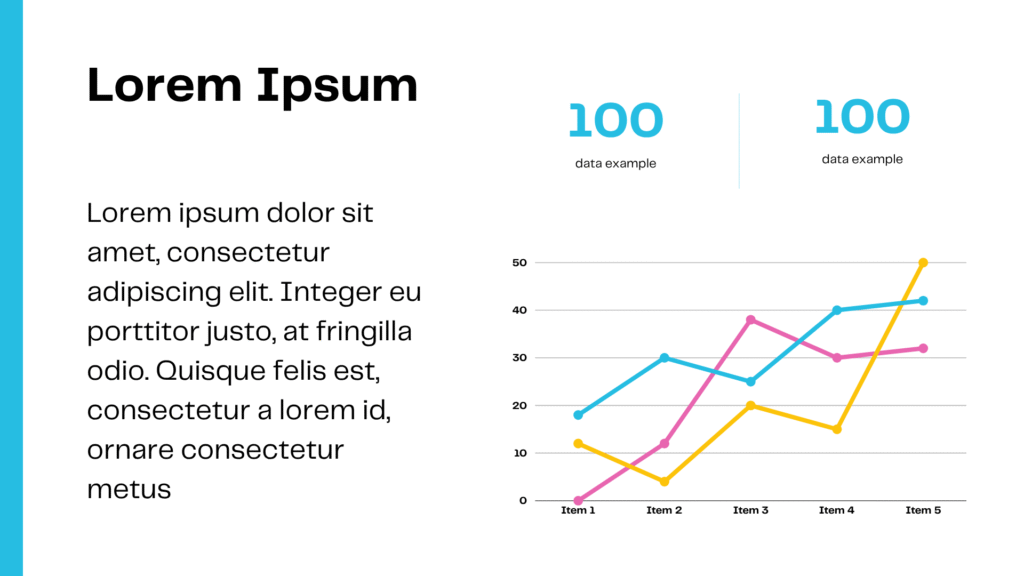
Canva offers ready-made aspect ratios in design templates, but most of them are made for social media, for example, and not for digital signage. For example, if you use square-sized content (1080×1080 px) and publish it on a 16:9 digital display, the result may be stretched, cropped, or out of focus. At worst, it will reduce the resolution to a very low level, making it impossible to see the content on the screen at all.
Canva templates and sizes that work best with digital screens:
Horizontal screens, aspect ratio 16:9
- 16:9 presentations
- Landscape video 16:9
Vertical displays, aspect ratio 9:16
- Mobile presentations, 1080x1920px
- Mobile videos, 1080x1920px
- Instagram Stories & Reels
- TikTok videos
- YouTube shorts
✅ Do this
- Choose the right aspect ratio before you start designing
- Take advantage of Canva resize function if you’re using the Pro version
❌ Don’t do this:
Default settings, other than 1920×1080 or 1080×1920, unless your digital screen is a special sized display.
Stumbling block 3 – Too many effects and animations
Canva invites you to try everything: shadows, gradients, glitter and animations – sometimes a little too much. However, less is more on a digital signage screen. Excessive effects can easily make the message confusing and difficult to read. At the same time, the company’s visual brand suffers. Use a simple background that follows the brand’s visual guidelines, combined with a sufficient amount of contrast and calm effects. Also pay attention to fonts that match the company’s brand.
✅ Do this
- Use a consistent color scheme (preferably company brand colors)
- Focus on contrasts and clarity
- Choose 1-2 fonts, not the entire Canva font library
❌ Don’t do this:
Avoid flashing or fast animations, excessive transition effects, and multi-colored backgrounds.
Stumbling block 4 – The brand is forgotten
As mentioned above, Canva makes content creation easy. However, the platform’s limitless possibilities can easily overwhelm you with a world of different templates. Different templates offer countless options for colors and fonts. When you try to fit them all in, your company’s visual identity breaks down and your message loses its recognizability. As a result, your company’s info displays start to look like a jumbled collection, where your brand identity is completely lost.
To avoid visual chaos, create your own Brand Kit in Canva, where you can store your company colors, fonts, and logos. This way, they will automatically be included in your design templates.
✅ Do this
- Create a Brand Kit in Canva: colors, fonts, logos, images and icons
- Make ready-made templates for different uses
- Keep the same visual identity across all content
❌ Don’t do this:
Blindly using templates just because the template “looks nice”
Stumbling block 5 – Lack of content testing
This is perhaps the most common and critical mistake. When your content is finally finished, it looks great on your computer, but when you take it to a large digital screen, something changes. Sound familiar? Digital signage screens are significantly larger than your computer screen, so the fonts, element placement, and overall look change when the content is displayed on the big screen. For this reason, the content producer should always view the content on the digital signage screens in the locations where the screens are intended to be viewed. Sometimes, for example, the brightness of the room may surprise you, and the contrast needs to be adjusted based on how the content looked on the laptop screen.
✅ Do this
- Go to where the displays are and put yourself in the viewers position.
- Check that the content is clearly visible in the correct viewing position
❌ Don’t do this:
Publishing Content without periodically checking its functionality.
In conclusion: Creating content for digital signage displays with Canva is easy when you remember these basics
Canva is a great tool for digital signage, especially now that it works directly within MediaCloud. With templates in place, brand colors saved, and messages concise, content on screens looks like it was created by a professional, even if it wasn’t created by a professional. And by avoiding these five mistakes, you’ll give your message the best possible chance to stand out and get noticed.
Do you want help with more effective digital signage? We’d be happy to help you design branded, functional, and visually clear info display content with Canva. Contact our sales team and we’ll spar you with best practices!
You can find more inspiration on the blog: Content production for digital signage with Canva »