Companies waste a huge amount of time and money on ineffective internal communication. According to research, an employee can lose up to 35 working days a year trying to resolve ambiguities caused by incompletely shared information. It is directly reflected in productivity, decreased motivation and slow decision-making. Yet many organizations still try to manage everyday life with email chains, intranet news and monthly reports. The information is there, but it is not visible where the work actually happens.
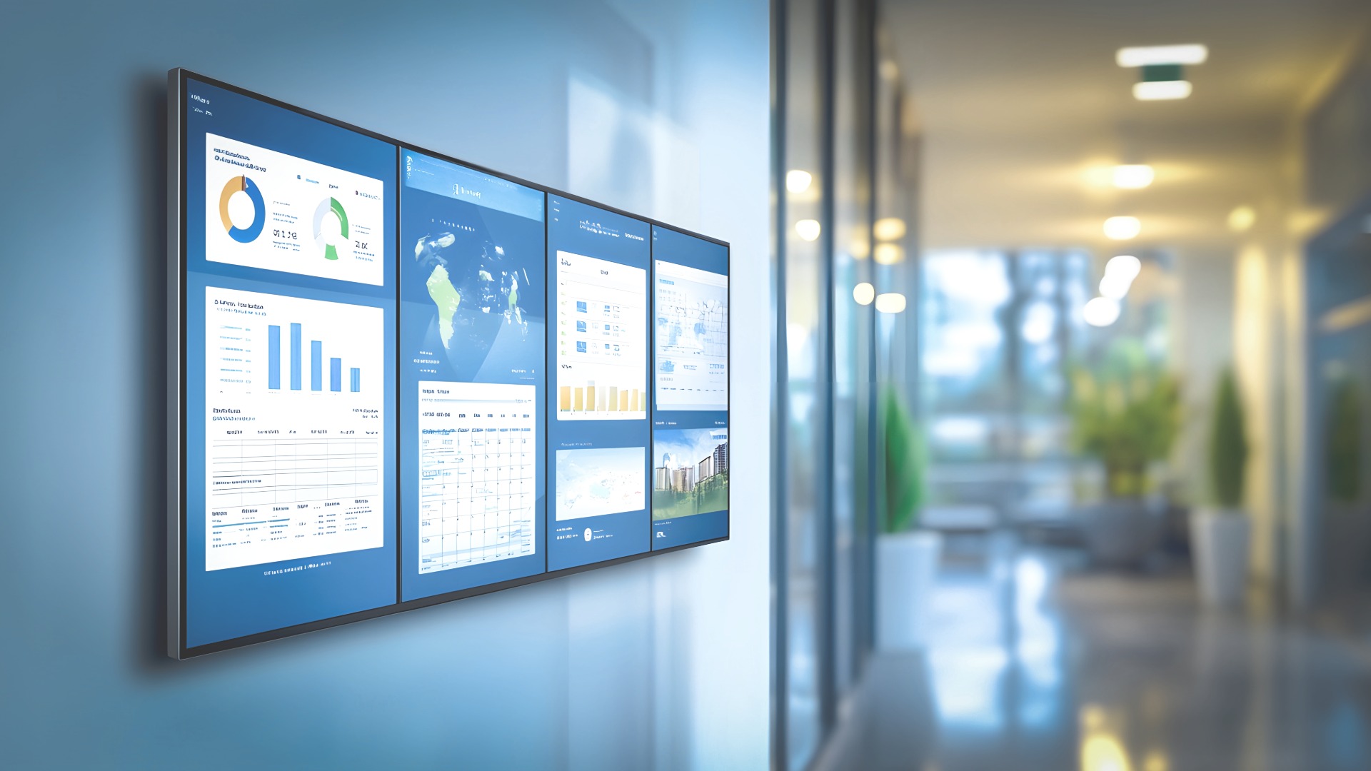
One of the most effective ways to enhance internal communication is to make important information visible in shared spaces. Power BI in digital signage brings real-time data, metrics, and alerts into the everyday life of the work community without anyone having to go separately to view the report.
What is Power BI – and why is it worth bringing it to digital signage displays?
Power BI is a tool developed by Microsoft that allows companies to collect, combine, and visualize data in an easy-to-understand format. It is used to create reports and dashboards that show the state of the company in near real-time:
- Sales figures, order books and delivery reliability
- Production lead times and disruptions
- Customer feedback and NPS
- Personnel-related metrics, such as absences or safety observations
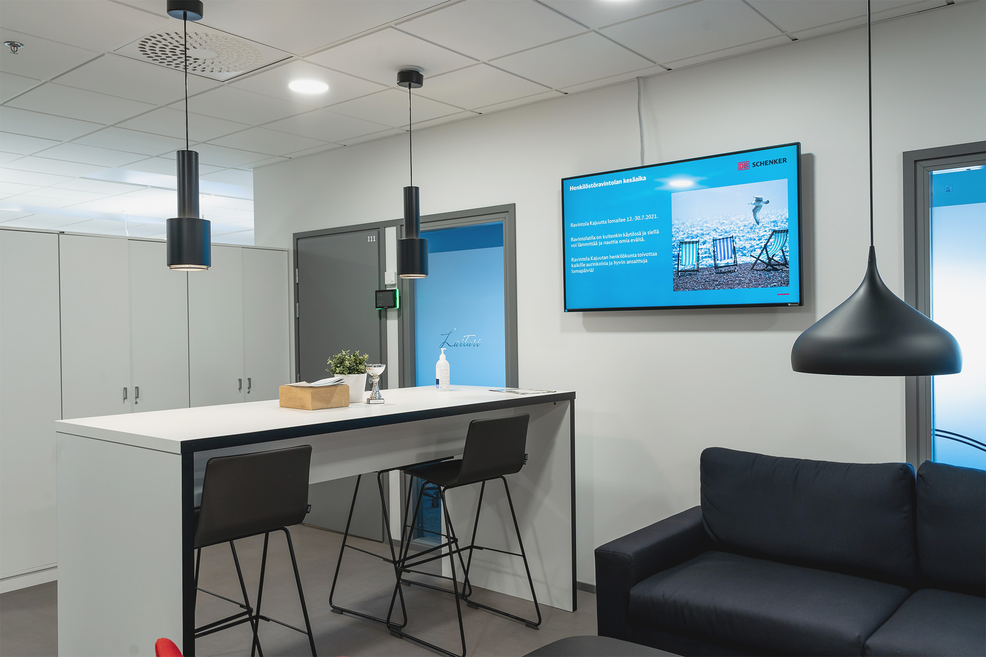
All of this content can be exported directly to the digital display. When data is made visible on shared screens in production areas, break rooms, logistics, customer service, or office corridors, it truly becomes a part of everyday activities, not just a report that someone opens sometimes.
Real-time visible data is becoming the new cornerstone of internal communications
Traditional internal communication works on a pull model: employees have to search for information themselves on the intranet, in emails, in stacks of reports or in different applications. This takes time, is stressful and causes uncertainty. Many people do not search and do their best based on guesswork.
Power BI in digital screens, on the other hand, push information to the right place, at the right time. In other words, practically right in front of the employee’s eyes without them having to start looking for information themselves. This makes data truly accessible, because the information does not need to be opened separately from their own reports or applications, but is visible where people otherwise move around and do their work.
At the same time, the information stays up-to-date because the snapshot is automatically updated without manual updates or monthly PowerPoint-screenshots. The data is also shared when everyone sees the same view at the same time – this reduces speculation, different versions of the truth and “this is what my Excel says” discussions.
In addition, information becomes action-oriented. When the meter goes red or an anomaly appears, you can react immediately, not until next week or at the next monthly meeting. According to researchs, organizations that invest in data visibility are clearly more profitable and have more customer loyalty. The difference comes from small, repetitive decisions where information is always present.
Read also: 5 tips for developing company culture and employee experience »
Internal communication is in crisis – visible data will correct the situation
Extensive research shows a big gap between the experiences of management and staff:
- 80% of managers believe that internal communication is clear
- Only about half of employees agree
- A fraction of employees feel fully aligned with the company’s goals
Poor communication causes companies to lose significant productivity per employee per year. At the same time, over 70% of employees say that a clear understanding of the company’s goals increases their motivation, productivity, and engagement.
When key messages, goals and metrics are visible continuously, and not just in monthly meetings, intras or manager speeches, a shared understanding is created within the organization. It supports better decision-making, reduces “doing things in the dark” and strengthens the operating culture.
This way, visible data strengthens internal communication in everyday life
When key metrics, alerts, and progress are visible in real time, the company has a constant snapshot of where it is going. Misunderstandings and unclear interpretations are reduced when both management and employees see the same numbers at the same time. At the same time, unnecessary reporting is reduced or even eliminated completely because the information is visible to everyone at all times.
This is also concretely visible in different environments.
- In production and logistics, digital displays show, for example, efficiency, queues, occupancy rates, alarms and safety messages.
→ Shifts are able to react without delay - Customer service and stores can display service levels, waiting times, customer feedback, and campaign results.
→ Customer promises are kept as promised - The data visible in office and expert environments provides information about project progress, sales targets, and strategic metrics, for example.
Real-time digital signage displays help make quick micro-decisions. Resources can be transferred, processes corrected and priorities refined exactly when the need arises. At the same time, employees can see the concrete impact of their own work on the results. This increases motivation and commitment, and in many cases can even be a more significant incentive than salary. When the company’s goals, customer feedback, successes and risks are openly visible to everyone, the transparency of the organization increases. Trust is strengthened, and the “us against them” model changes to a “us together” model.
Read more about Production Control solutions »
Also read the blog, How digital signage displays can improve internal communication »
What results can the organization expect?
International studies and practical customer examples show that visible and real-time data produces clearly measurable results in organizations. Productivity typically improves by several percent when teams see problems as they arise and are able to correct the situation without delay. At the same time, labor costs are reduced because shift planning and resource allocation are based on up-to-date information.
The service level also improves when prioritization is clear and visible alerts help to maintain agreed SLA levels. In addition, management becomes more efficient because management does not have to spend their time hunting for problems in different systems or reports; the situational picture is visible at all times, leaving more time for decision-making and development. At the same time, the perceived meaning in work is strengthened. When employees better understand how their work affects the organization’s goals, they feel that what they do matters more – and it is reflected in both results and the employee experience.
This is how you can get started without huge investments
The good news: improving internal communication with visual displays doesn’t have to start with an expensive and complex project. Just one well-designed Power BI dashboard and a couple of digital displays are enough to measure the impact in practice.
A few practical tips:
1. Choose critical KPIs
Start with the metrics that really matter. For each number, ask: What will we do differently if this goes into the red? If you can’t find the answer, the metric may not belong on the front screen.
2. Design visuals for the screen, not the report
Small tables are not readable on the digital screen. The dashboard should be visual, clear and easy to understand. Color codes, simple graphs and clear headings beat complex report templates.
3. Connect data to other internal communications:
The screen doesn’t just need to show data. Alongside the metrics, you can also import:
- Current news and announcements
- Successes and recognitions
- Safety and well-being communication
- Upcoming events and campaigns
This way, the dashboard is not just a “wall of indicators”, but part of live internal communication!
4. Monitor the effects and develop
Observe what changes: is the response speed up, are errors reduced, are goals remembered better? Also ask staff what they would like to see on the screens – often the best ideas come from those who work on a daily basis.
If you need sparring, design assistance or implementation for info displays and Power BI dashboards, we are happy to help. Contact us and together we will build internal communication that is seen, heard and, above all, has an impact.
Sources:
2025 State of Internal Communication Report, Axios HQ
2023 State of the Global Workplace Report, Gallup Inc.


